Showreel from Elissa Boswell on Vimeo.
Here is a showreel displaying all of the work I have done on After Effects throughout the year.
Monday, 9 May 2016

Saturday, 7 May 2016
C4D Can and Bottle Packaging Design

The first step was to import the file into C4D and used tool to create the cylindrical can shape. We then created the lid which was fairly easy to do using the different view settings and seeing it from a range of angles simultaneously. After this we made a material which would wrap around the perimeter of the can and for this we just imported the imagery provided earlier. Adding a reflective surface effect on the outside of the can really enhanced the 3D feel and I decided to use the colour orange as a contrasting background in order to portray the design as clearly as possible. The final step was to add a spotlight before rendering.
Next we tested out some of the techniques we had previously learnt to create a bottle package design. Again we were provided with an outline and the imagery to apply and I found this useful as I believe that after taking part in this workshop I can create my own imagery and apply it to a digital bottle/can with confidence.
Similarly to the creation process of the can we used the lathe tool on the outline in order to create a 3D bottle shaped. We then added a preset 'green glass' material and used the shape tool to create a tube which wrapped around the bottle. The next step was to add the label as a new material and use the alpha channel to remove the background. We applied the design to the tube shape which gave the appearance of a wrap-around label.
The bottle top was created in a few simple steps by merging 3 circles and a 12 sided star. To this we added a preset metal texture and added the label using another alpha channel.

CAD - Dynamic Type

Next we created 4 individual letters and made them a 'child' of the emitter.

Next I added a dynamic body tag to all of the letters which gave them mass so they would interact with each other rather than just moving straight down.

Then I added a large letter E and a floor, for all the letters to fall on and interact with further.

Next I added different colours to each of the letters so that they would be more easily distinguishable when they where falling. Finally I added some spotlights and shadows and rendered out the final result

Overall, I am not particularly happy with the final result but am very happy with the techniques I learnt. These are definitely tools I would like to use and experiment with in future.
C4D - 3D Type
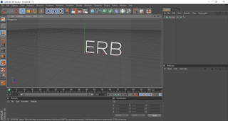
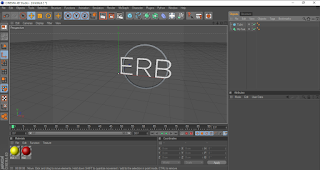
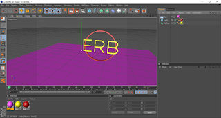
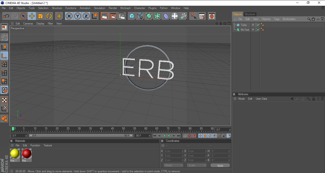
In this week's workshop we learnt how to create 3D logos using Cinema 4D. We created the initial outlines in illustrator and imported them in to C4D. Next we extruded the outlines in order to create 3D versions of our letters. The next step was to draw a tube shape around the letters and extrude that to create a 3 dimensional floating border. Then we added simple colours to each of the components and also to the floor of the workspace in order to create a contrasting background. The final step was to add lights in order to give the logo an even more 3 dimensional feel.




Fairytale Statistic Infographics
Fairytale Statistic Infographics from Elissa Boswell on Vimeo.
In this lesson we used the foundation of a well-known fairytale in order to animate info-graphics. For this I chose the frog prince.
We first created a scene in Illustrator which consisted of different layers to allow the manipulation of individual components. Next we imported these layers into After Effects and added motion keyframes along with the relevant statistical text. Overall I am quite happy with how my animation came out. I feel the techniques I learnt were useful and I could definitely apply them to future work. I would like to develop this project further in my own time.
In this lesson we used the foundation of a well-known fairytale in order to animate info-graphics. For this I chose the frog prince.
We first created a scene in Illustrator which consisted of different layers to allow the manipulation of individual components. Next we imported these layers into After Effects and added motion keyframes along with the relevant statistical text. Overall I am quite happy with how my animation came out. I feel the techniques I learnt were useful and I could definitely apply them to future work. I would like to develop this project further in my own time.
Stop Motion Analogue Communique - Let Go
letgo from Elissa Boswell on Vimeo.
In this week's session I decided to use the same medium of cotton wool but to form a slightly different message. I chose to use the phrase 'Let go' as I felt this was something I could portray effectively through the cloud-like appearance of my materials.
I began by creating a template using tracing paper. This didn't have to be too precise at this stage as I was aware that I would make a further template from acetate and then cover this with the cotton wool. I deliberately made the template of the two words joined together as my plan was to create a stop motion video of the two words separating much like clouds would in the sky. I felt this technique would not only connected the motion to the words but also the material I had used.
Once I had made the acetate template I tacked it down to a board and cut it in the areas where I wanted the letters to separate. This meant that I could keep the words together for the application of the cotton and also that the material would separate more naturally when I pulled the acetate apart. I then used pva glue to stick on the cotton wool ensuring that all areas of the plastic were covered. Finally I laid the piece out on the same blue background I have previously used in the analogue communique project and separated the letters taking photographs at every step. I tried to keep each movement slight and kept in mind the movement of clouds and how they would move independently.
I was really happy with my final outcome as I feel it gave off the effect I was striving for.


In this week's session I decided to use the same medium of cotton wool but to form a slightly different message. I chose to use the phrase 'Let go' as I felt this was something I could portray effectively through the cloud-like appearance of my materials.
I began by creating a template using tracing paper. This didn't have to be too precise at this stage as I was aware that I would make a further template from acetate and then cover this with the cotton wool. I deliberately made the template of the two words joined together as my plan was to create a stop motion video of the two words separating much like clouds would in the sky. I felt this technique would not only connected the motion to the words but also the material I had used.
Once I had made the acetate template I tacked it down to a board and cut it in the areas where I wanted the letters to separate. This meant that I could keep the words together for the application of the cotton and also that the material would separate more naturally when I pulled the acetate apart. I then used pva glue to stick on the cotton wool ensuring that all areas of the plastic were covered. Finally I laid the piece out on the same blue background I have previously used in the analogue communique project and separated the letters taking photographs at every step. I tried to keep each movement slight and kept in mind the movement of clouds and how they would move independently.
I was really happy with my final outcome as I feel it gave off the effect I was striving for.

Sketch Effect Animation (Using Clipping Masks)
Forest: Just One Day from Johnny Kelly on Vimeo.
In the week's After Effects session I learnt how to use clipping masks in order to convey an effect a digital image being hand-sketched. I began by drawing a simple shape and drew over it twice using tracing paper. This would create three separate images which appeared identical to the naked eye but would in fact be slightly different due to them being hand-drawn. I specifically created 3 different versions of the image as when overlaid it would create a flickering effect when looped. With an even number of images a pattern may be more noticeable and this would not be beneficial in achieving the sketchy hand-drawn effect we were going for. After overlaying and looping the images we used a clipping mask to draw over the lines in the way we would like the to appear on screen. I tried to work from the bottom to the top of the diamond but it was difficult to make this appear as one continuous line as the shape was made up of so many lines which went in different directions.
Overall I was happy with my final outcome and even added a little twinkle to the diamond to finish off the video.
James Braithwaite - I Met the Walrus from POCKO on Vimeo.
Clipping Path Diamond from Elissa Boswell on Vimeo.
In the week's After Effects session I learnt how to use clipping masks in order to convey an effect a digital image being hand-sketched. I began by drawing a simple shape and drew over it twice using tracing paper. This would create three separate images which appeared identical to the naked eye but would in fact be slightly different due to them being hand-drawn. I specifically created 3 different versions of the image as when overlaid it would create a flickering effect when looped. With an even number of images a pattern may be more noticeable and this would not be beneficial in achieving the sketchy hand-drawn effect we were going for. After overlaying and looping the images we used a clipping mask to draw over the lines in the way we would like the to appear on screen. I tried to work from the bottom to the top of the diamond but it was difficult to make this appear as one continuous line as the shape was made up of so many lines which went in different directions.
Overall I was happy with my final outcome and even added a little twinkle to the diamond to finish off the video.
James Braithwaite - I Met the Walrus from POCKO on Vimeo.
Clipping Path Diamond from Elissa Boswell on Vimeo.
ae unfolding cityscape
MGMT - All We Ever Wanted Was Everything from oneedo on Vimeo.
In this lesson experimented with the page-turner technique on After Effects and used cameras to give an effect of a slow pan out from a 3D environment. We looked at the MGMT music video presented above, for inspiration and took not of how the scene seemed to unfold as the video progressed.
The first task was to create our own scene on illustrator ensuring that each of the areas of the scene which I wanted to unfold were on separate layers. I then added texture to one of the layers in order to add a sense of depth and to better differentiate these layers more effectively. Next I applied the page turning effect to each of the shapes from the bottom to the stop in order to convey the effect of them being slowly pasted into place. The final step was to add a camera which panned from the background to the foreground of the vector environment which I feel really rounded off the video.
I went for a simple landscape in order to ensure a better understanding of the techniques used and I was quite happy with the way my unfolding city turned out.
Unfolding City from Elissa Boswell on Vimeo.
In this lesson experimented with the page-turner technique on After Effects and used cameras to give an effect of a slow pan out from a 3D environment. We looked at the MGMT music video presented above, for inspiration and took not of how the scene seemed to unfold as the video progressed.
The first task was to create our own scene on illustrator ensuring that each of the areas of the scene which I wanted to unfold were on separate layers. I then added texture to one of the layers in order to add a sense of depth and to better differentiate these layers more effectively. Next I applied the page turning effect to each of the shapes from the bottom to the stop in order to convey the effect of them being slowly pasted into place. The final step was to add a camera which panned from the background to the foreground of the vector environment which I feel really rounded off the video.
I went for a simple landscape in order to ensure a better understanding of the techniques used and I was quite happy with the way my unfolding city turned out.
Unfolding City from Elissa Boswell on Vimeo.
Friday, 12 February 2016


3D Typography
I chose to use light cushion stuffing as my medium and came up with the word 'float' as the material immediately brought to mind the image of clouds. The difficult part was figuring out a way in which to present the word and how to physically form the letters out of the material. Although the stuffing was easy to mould into the desired letters I struggled to find a way in which to ensure that it remained in shape. I thought about using things like glue or even something like hair gel/spray/wax to keep the light material in place before coming to the conclusion that I could mount the letters on the underside of clear tape. This meant that the word would remain almost weightless which in turn would connect the word with it's form of presentation. Above is an example of how I created the letters.
After creating all of the letters I next had to come up with an appropriate way of displaying them which resonated with the message I was conveying. I thought about ways in which I could make the word appear to be levitating and decided to use thin transparent wire to achieve this. However after experimenting with different compositions I chose to use a more visible means of hanging the work such a string. I felt that displaying it against the window connected the word float with it's meaning as it appeared at one with the clouds while at the same time the message was contradicted as onlookers can see how the font is clearly tethered and has constraints.
Typography

The challenge in this week's process and production studio session was to experiment in type creation and form a sentence beginning with 'I am' within a 4x4 grid. I began by making a small mock up on A4 paper before moving up in scale. Pictured above is type I created using masking tape and ink in order to ensure the lines were straight resulting in better legibility. I really wanted the font and the message to be intertwined which is why I chose to have only parts of the block-style letters on show.

The next stage was to move up in size again to not only make a bigger impact but also to show that the typeface could be scaled up or down and continue to be effective. This time I thought more deeply about the message I was aiming to convey and decided on a change of medium. If a person was in hiding then they are likely to be self-conscious and lacking in confidence. I did not think that the straight structured lines within the first grid pictured, gave off this feel. The typography pictured above was hand painted which gives off a personal touch and also makes the text appear vulnerable and not quite as structured as the first time around.
Finally I thought it would be fun to display my type in a way which related to the message it conveyed. Setting the grid out in a very public place contradicted the message and I thought this would be a good way to challenge the concept of self consciousness.
Saturday, 2 January 2016


Thursday, 17 December 2015


Monday, 2 November 2015
Primary Research
When thinking about gaining primary research I decided to gain knowledge around the subject of online anonymity. I chose to use the website Reddit. Reddit is commonly used as a forum-based website whereby users post talking points and things that they find interesting in order to engage with other online users and hopefully find common ideas between people. You can also post questions which anyone is free to answer without leaving your full name or any personal details. I decided to ask the question ‘What conversation would you have with your 10 year old self?’ I thought this would be appropriate to the project as it is a rather personal question which still recieved a large amount of responses which I probably would not have recieved if I had asked these questions to strangers face-to-face. Some responses were more personal than others touching upon childhood issues and things that they may have found inspiring at the time with hindsight.

After receiving a few comments from my first question I decided to try again with the question; ‘Why is it so wrong to break up with someone via text message?’ I thought this again would be relevant as it connects the themes of people and relationships and also the theme of the ability to hide behind a screen and somehow feel less responsibility. The replies I recieved were exactly what I expected and gave off the general feeling that it is incredibly disrespectful to do this to someone. This however begs the question; Why? So many of our relationships these days are based around instant messaging and social media so why can we not discuss the starting and ending of relationships through this media?

I also came across the website Omegle which is slightly controversial. It has a webcam feature which allows strangers to connect from all over the world in a face-to-face scenario. Naturally this results in some content which is NSFW to say the least however I came across a feature whereby I could anonymously ask a question and watch two strangers discuss it on my screen. Again I chose to ask a really personally question in order to hopefully show how people may be more comfortable to discuss said topics without embarassment or responsibility.

I have presented just one of my responses above which touches upon personal issues experienced by these strangers and how their experiences may have the ability to bring them together. I personally found this incredibly interesting and started to think about how strange and completely differently these conversations would unfold in a real-life scenario. This again highlights how people are ultimately more comfortable behind a screen than they may be in person.
Intro to Studio Project - Conversation
Project/Assessment Task: Brief: A Conversation
Take time to develop ideas and experiment with different media, materials and technologies. Play with instructions, reinterpret, disrupt, reinvent...
What’s the most important conversation for today?
What’s the most important conversation for the future? Who will you speak to?
What is the message?
Through the application of your chosen practice you are asked to research and develop a visual outcome that centres around the idea of ‘A Conversation’.
Basic examples or starting points you may want to explore could include:
Consider the conversation between yourself and technology, the internet, phone apps.
Look at current social behavior, group activities, communities, lifestyles, conventions, business, leisure, play. An external, political or social conversation that you may support or contest.
Consider the conversation creative industry professionals have with the notion of communication, technology and society.
We also want you to consider the most appropriate mediums for presenting this 'Conversation':
Graphic Design
Posters, Fanzines, Book, Magazine, E-zine, Manifesto, Marketing Strategy, Direct Mail, Advertising Campaign, Advertisements, Copy, Photography, Social Media (Facebook, Twitter, Instagram, You Tube, Vimeo, Vine, etc...).
Considerations:
Where is the most important place for the conversation to take place? How will the conversation be heard?
Who will your audience be?
What are your aims?
Who will benefit?
Aims:
Undertake creative and ambitious research.
Develop a brief through research and development.
Examine the conceptual and aesthetic potential of “a conversation”. Innovate and explore technical parameters.
Create a contemporary portfolio piece.
Make your chosen audience pay attention to your work.
Requirements:
A portfolio of designs involving a high degree of creative and technical skill and also market justification, in which there is a clear reasoned and personal response to the requirements of the brief. Background material in the form of research and concept development will be of a high standard and will clearly support the final outcome. Each assignment will incorporate a high degree of finish and presentation, with all aspects of the brief taken into account.
‘A Conversation’
As Digital Natives you inhabit a seamless, immersive existence with technology; negotiating relationships with the environment and with each other; in the pursuit of connectivity, discovery, creativity and innovation...
This emerging programmable world has created a whole new division between the virtual and the physical; a designable environment, a playground for coders, requiring digital design disruption at all levels. We have to intervene and prioritise unprecedented environmental, social and cultural crisis if we are to become effective visual communicators and address real user experiences to provide meaningful design futures...
Cutting out a Moving Image
This week in the After Effects workshop we worked on cutting out a moving image and using the mask tool to animate said image.
I brought some royalty free looping video clips and a pre-made illustrator background in order to make the process quicker. I made a simple layered background of a landscape and chose a running horse for my moving image as I thought this would be aesthetically effective in the final result.
After importing that into Adobe After Effects I stretched out the timeline to make it easier to edit frame by frame. I used the clipping mask tool to trace around the moving image every couple of frames when it moved into a different position. This basically cut a hole in the image and moved frame by frame with the looping animation.
The next step was to remove the original animation and fill the cut-out section with a solid colour which would effectively show up against my background. I then imported the background layer in order to put the two pieces of imagery together and see what effect this resulted in. At this point I had a coloured background with a horse which remained in one position with consistently moving legs. To resolve this I moved the image out of frame and added position keyframes to give the effect of the animal's legs moving and subsequently carrying it from the right to the left of the screen.
Below is the final example of what I achieved in this week's After Effects workshop and although I found it challenging I did enjoy creating the final outcome. If I were to do this task again I would refine the drawings of each frame and ensure that it loops perfectly as the final piece does not quite loop accurately as there was not enough material to trace around.
The Running Horse from Elissa Boswell on Vimeo.
I brought some royalty free looping video clips and a pre-made illustrator background in order to make the process quicker. I made a simple layered background of a landscape and chose a running horse for my moving image as I thought this would be aesthetically effective in the final result.
After importing that into Adobe After Effects I stretched out the timeline to make it easier to edit frame by frame. I used the clipping mask tool to trace around the moving image every couple of frames when it moved into a different position. This basically cut a hole in the image and moved frame by frame with the looping animation.
The next step was to remove the original animation and fill the cut-out section with a solid colour which would effectively show up against my background. I then imported the background layer in order to put the two pieces of imagery together and see what effect this resulted in. At this point I had a coloured background with a horse which remained in one position with consistently moving legs. To resolve this I moved the image out of frame and added position keyframes to give the effect of the animal's legs moving and subsequently carrying it from the right to the left of the screen.
Below is the final example of what I achieved in this week's After Effects workshop and although I found it challenging I did enjoy creating the final outcome. If I were to do this task again I would refine the drawings of each frame and ensure that it loops perfectly as the final piece does not quite loop accurately as there was not enough material to trace around.
The Running Horse from Elissa Boswell on Vimeo.
Cereal Packet Design Continued

The first step was to scan in our hand-rendered drawings and edit the levels of the image in photoshop in order to make the lines more defined and subsequently easier to draw around in Illustrator.
I used multiple layers for the box net, outline and colour to make the refining process easier to breakdown. I found that with the lettering and certain parts of the image like the character's hat the end result looked more aesthetically pleasing when I used the pen tool more loosely and allowed colour from the layer below to peek through. I also created a simple graphic for the back of the cereal box as many of the other's I had looked at for inspiration did not use extensive amounts of detail for the back design.
I will continue with this design in my own time in order to see this finished product but I am happy with my progress so far.
Wednesday, 7 October 2015
Cereal Box Design
Our task within the process and production workshop this week was to work on the development of a character that would be suitable to be used on a cereal box. Using the target audience of young children we first explored examples that may positively influence us when developing our own character.
I found the blog below very interesting as it showed the flow of thought of the concept artists working on some classic well-known films. It was obvious that this experimental process was essential in highlighting the strong concepts.
http://livlily.blogspot.co.uk/2010/11/model-sheets-production-drawings.html
This first issue I had to overcome before attempting this task was my confidence with drawing. Without clear references I find it difficult to draw something that I would be happy with and I found this hard to overcome at first. Jay encouraged me to play around with shape and form without too much concern with the final outcome as the design could be edited later on illustrator.


I found the blog below very interesting as it showed the flow of thought of the concept artists working on some classic well-known films. It was obvious that this experimental process was essential in highlighting the strong concepts.
http://livlily.blogspot.co.uk/2010/11/model-sheets-production-drawings.html
This first issue I had to overcome before attempting this task was my confidence with drawing. Without clear references I find it difficult to draw something that I would be happy with and I found this hard to overcome at first. Jay encouraged me to play around with shape and form without too much concern with the final outcome as the design could be edited later on illustrator.


After coming up with a few ideas for characters that may appeal to my target market I began to think about focusing on one idea and experimenting with composition and layout.

I decided to progress with the little boy character after some peer reviewing and began to play around with how I could find an equilibrium between the illustration, typography and product. I also explored options with the name and how to present this. Next week I will be experimenting with the use of colour in illustrator and tightening up the illustration.
Friday, 2 October 2015
Loops and Living Holds
Thomas Beale Cipher Experiment from Elissa Boswell on Vimeo.
In this week's After Effects workshop we analysed a piece called Cipher by Thomas Beale and attempted to create an animation which took inspiration from the techniques he used.
I created a simple figure in Illustrator and imported the imagery into After Effects in order to animate particular features of the character. We used the wiggler tool in order to give an effect of erratic movement. I found this worked well on the moustache feature of the character as it gave the effect that the figure was talking behind it.
I struggled with joining some of the features together to ensure that they moved simultaneously but ultimately managed to tie the head and moustache together so that when they head moved from side to side the facial hair remained in the correct place. I just did this by dragging the spiral key to interlink the layers and placing keyframes in the correct place in order to make the movement appear fluid and natural. Unfortunately as I struggled with a few of the elements of production the imagery is not animated for the full 10 second duration. I plan to update this in the near future and hopefully create an additional animation using the same techniques which I have learned.
Subscribe to:
Posts (Atom)